Working closely with Curve Coffee Roasters, we developed a fresh brand identity that reflects the purpose and personality of Curve Coffee after 5 years of roasting.
Being a fresh and young business we wanted to bring in Curve’s sense of fun and vibrancy. Each coffee has its own visual identity (created and illustrated by Sally Cowell Design), an abstraction of the flavour notes unique to that coffee. Their Rare & Unique coffees often celebrate artwork and illustrations by feature artists.
Outstanding and delicious coffee is at the heart of the business, but striving for more sustainable methods and operations to ensure that this benefits producers and is kinder to the planet is key too. The packaging is made from recyclable sugarcane based BioPE.
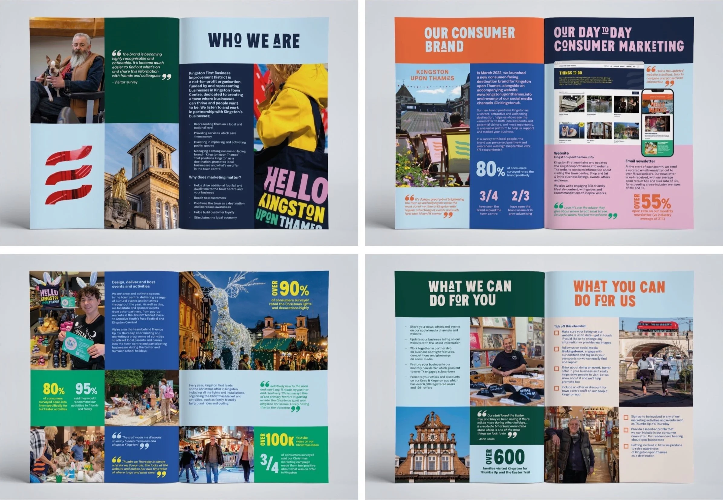
I work closely with Kingston First (BID) on locally based projects promoting Kingston upon Thames as an exciting destination. We have created vibrant and engaging brochures for their members, exciting hoardings around vacant units in the town centre, as well as other projects for the town.
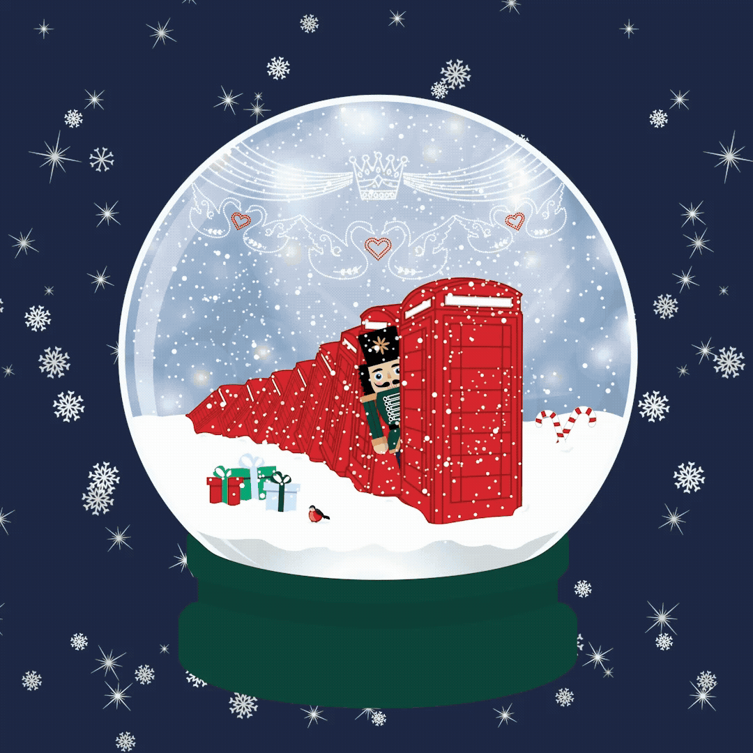
CHRISTMAS CAMPAIGNS
Promoting Kingston as THE Christmas destination for visitors to enjoy shopping, entertainment, the Christmas market and fabulous food and drink.
I have worked with Kingston First on several Christmas campaigns that have focused on what Kingston has to offer over the festive period, including nutcracker trails and favourite Kingston Christmas traditions.
Applications include various environmental signage, JCDs, print collateral and digital (including animation).
LIGHT UP KINGSTON
I worked with Kingston First on an art focused campaign to promote Light Up Kingston - an event run through the half term week of February. Stunning light installations are featured throughout the town centre that visitors are invited to explore and immersive themselves in the sensory experience that incorporates visual, touch and movement.
I developed the concept of the abstract shards of coloured light that overlay to create exciting colour and movement. The artwork varied (and moved where applicable) to suit the individual communication - from large pieces of signage to postcards and social media posts.
Statkraft is Europe’s largest generator of renewable energy. I work regularly with Statkraft on their community exhibition materials, newsletters and digital communications in accordance with their brand guidelines.
I have been fortunate to work with the great community at the London Irish Centre over the last few years on various design projects using their brand toolkit (which has recently been updated; see What’s On poster for the latest brand style).
Projects have included events materials, such as posters, invites, social media and brochures; their first Impact Report detailing the quality work the charity has carried out in that year; various social media campaigns and marketing materials.
A brand identity created for Matt at Lazy Coffee to reflect his positive and relaxed outlook on life as well as his passion for good coffee.
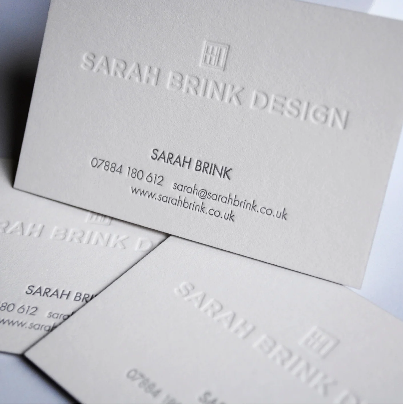
Working closely with Sarah to develop a brand identity for her Interior Design business that reflects her personality and design principles. Producing a set of guidelines that enabled Sarah to ensure that brand application across different mediums, including print and web, would remain consistent.
sarahbrink.co.uk
Project completed with Lindi Reynolds Interiors.
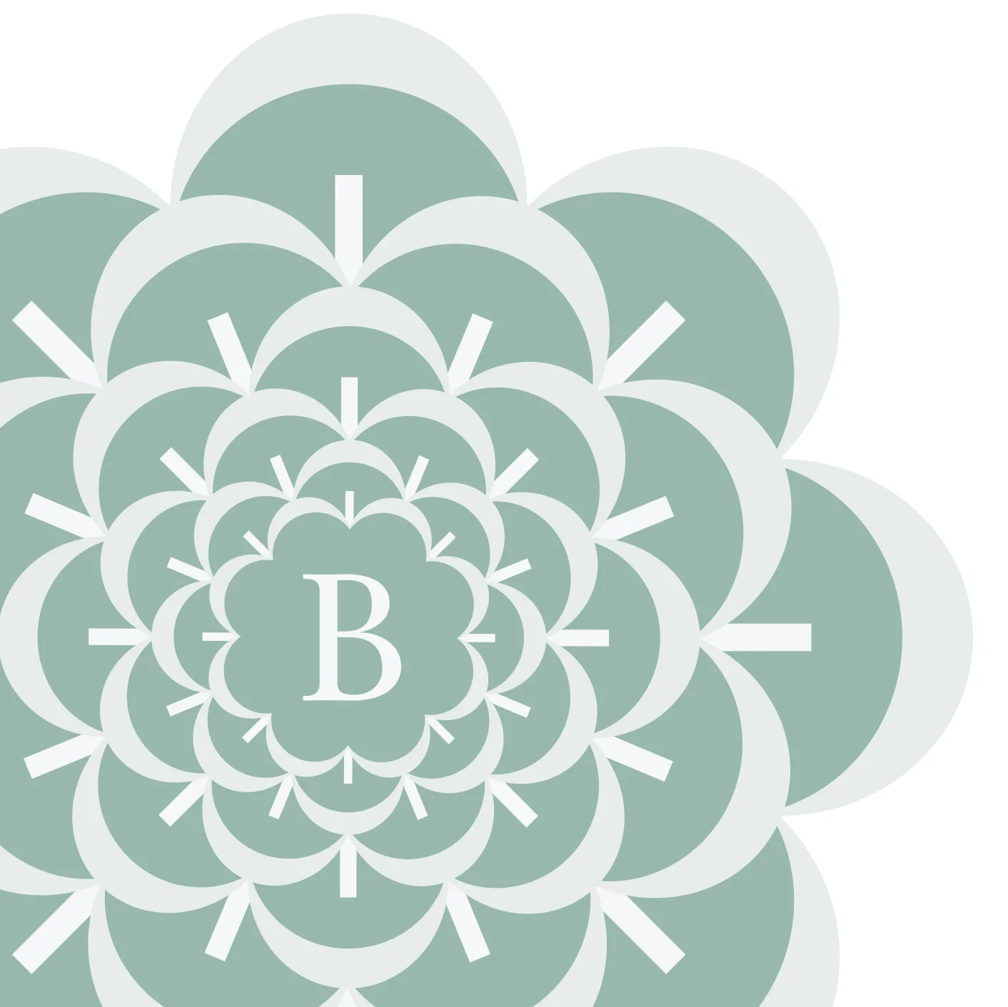
The owners of Beauchamp Court Care Home (formerly Malmsbury House) approached Lindi Reynolds Interiors to rename and rebrand the 19 bed home with the objective of giving it a more premium positioning within the community. We developed a brand strategy document for them as well as a brand mark, colour palette and supporting stationery and signage.
The approach for the identity centres on the strong Fir tree that stands at the front of Beauchamp Court. The scales of the tree's fir cones imbricate - layer and fold - beautifully around each other forming an ‘embrace’, representing nurture, compassion and care; the scales also represent the residents’ layers of life. The central ‘B’, beautiful in it’s positioning - it’s shape further echoing the ‘embracing’ curves and layers of the pine cone scales.
An identity for Scala Colab - a London based, global reaching social enterprise who research, design and inform policy to create inclusive, resilient, sustainable places. The logo has a playful application with changeable backgrounds, reflecting on creative solutions, diverse environments and projects.
The project involved identity design, brand application, designing and building the Squarespace website.
Design and development of a fun and engaging brand identity for a large children’s department store in The Avenues shopping mall in Kuwait, with a bright colour palette and playful characters. The identity allows for a family of sub-brands (Baroue Toys, Baby Baroue and others) that featured throughout the store and across multiple platforms.
Application of the brand in a playful way across print, packaging and signage throughout the retail environment, creating an exciting and vibrant one-stop shop for children (and parents).
Project completed at Gensler.
During my time working at Gensler we were invited by the World Retail Congress to design its 2008 event in Barcelona where the congress theme that year was sustainability. The aim was to design an event that provides maximum visual impact with minimal environmental impact; and to create a memorable environment that encouraged interaction, using materials that were inexpensive, recycled, recyclable and that folded flat.
The 2,300m2 main hall was divided into 3 hubs carrying information and sustainability pledges set by the various retail exhibitors (including M&S) around the themes: Environmental (green), Economical (blue) and Social (pink).
To ensure continued curiosity from the attendees, every box was printed on multiple sides that allowed an over-night re-configuration of the hubs and a change of message.
FX Award Winner.